Space completed using the one and only technology
with the sole aim to make the future happier and healthier.
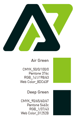
“A” stands for Air and “P” for Premium, representing the company’s will to provide the best premium air to customers.
The harmonized combination of the deep green representing forest and the green representing air circulation expresses clean air flow.
The company’s symbol represents circulation.
The “A” shape drawn from the left to the center expresses external clean water and air flowing into the inside, and the “P” shape from the center to the right represents the company’s will to provide a pleasant indoor environment with circulation of this clean water and air.
The circulating air expresses the company’s “vision” to increase customers’ value of life and provide a cleaner environment to customers through clean air, which is the core of life. The flowing water expresses the company’s “mission” to make all of us happy with innovative technologies and services that provide air conditioning and clean air, which are closely related to customers’ quality of life.